Ribbon
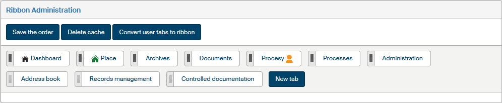
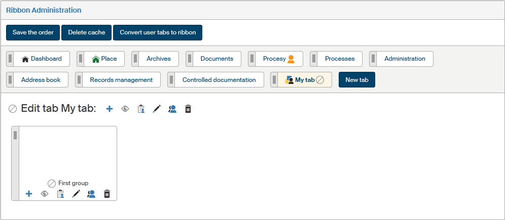
Visit the Ribbon Administration screen (). You can adjust the order of ribbon items here.
The whole ribbon consists of several tabs displayed in a row. Each tab can be divided into several topical groups, combining buttons with similar functions. The whole structure is as follows:
-
There is always a single ribbon in FormFlow, composed of several tabs.
-
A tab may consist of one or more item groups.
-
A group may contain one or more sections – named buttons.
-
A section may be either a link to a specific function or a page, or a group of several such items – in such a case clicking the icon will expand a list of items placed in the section. The individual items link to the specific functions or pages.
The list of existing tabs is displayed as a horizontal bar in the same order as the resulting ribbon. Click the tab name to display its contents.
| If a section contains only a single item, then instead of a section name and icon, the name and icon of the item is displayed together with its link and settings. |
Click New tab to display the dialog window to create a new tab. Click the title of an existing tab to expand its contents and controls.
There are several buttons placed above the tab list:
-
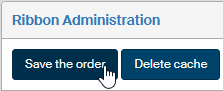
Click Save the order to confirm and save any changes in the order of items in the structure. For more details, see chapter Item reordering.
-
The structure of access privileges to the individual parts of the ribbon may be complicated. This is why FormFlow creates a cache of these privileges, used when displaying the ribbon. Use the button Delete cache, placed above the list of tabs, to delete and regenerate the whole saved structure of access privileges.
-
The button Convert user tabs to ribbon displays a list of existing user-defined tabs, used in older FormFlow versions. Use the checkboxes in the Convert to ribbon column to select which user-defined tabs to convert to the ribbon tab structure. Click Convert user tabs to confirm.
Creating a tab and its basic properties
Creating a tab
Click New tab to add another tab to the ribbon. A dialog window is then displayed, where you can enter the basic details of the tab, such as its name (you can choose different names for different language versions) and a unique Ribbon SID.
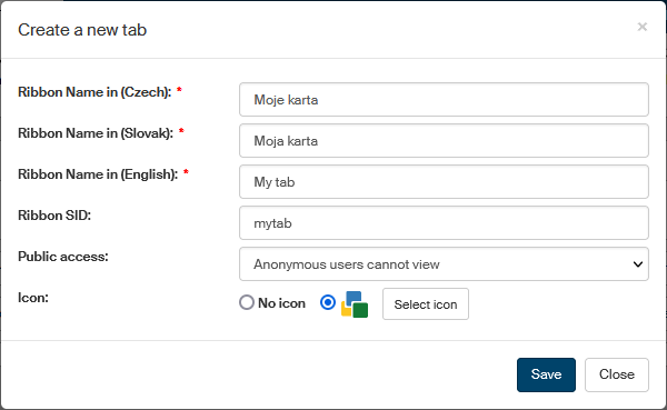
Use the Public access field to set the tab’s public visibility. The options include Only anonymous users can view; in such a case the tab will not be displayed to any logged-in users.
In section Icon, you can choose an icon to use as the tab symbol. Click Select icon to display a dialog with icon selection and select one. An icon is not mandatory, you can keep the No icon option.
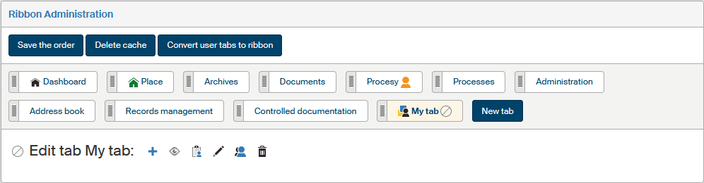
Click Save to confirm. The tab is now created and added to the tab list. Click its name to display the contents, which is empty at this point. The symbol  in the corner of the tab label indicates that the tab is disabled.
Editing a tab
A tab always contains a group of edit buttons you can use to set up its properties. The buttons offer the following functions:
-
 Create a new group – displays the dialog to add a group, in which you can then place the individual buttons.
 -
 /
/  Show or hide. If the tab is set to show, it will be displayed in the ribbon to the users who are authorized to see it. A hidden tab is not displayed to anybody and is marked with the symbol in administration.
 -
 Set permissions – displays a dialog window where you can assign or remove the privileges to see or edit the tab.
 -
 Edit tab – displays a dialog window where you can edit the tab’s basic properties (just like when creating a new one).
 -
 Show effective permissions – displays a dialog window with a list of users authorized to view or edit the tab.
 -
 Delete tab – removes the whole tab. The button is not available for system items that cannot be deleted.
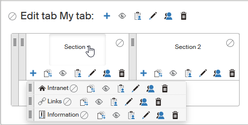
The tab’s content itself consists of one or more groups.
Adding and editing a group
Buttons on the tab can be organized into more one group. Groups are separated with a vertical line.
Creating a group
Click Create ribbon groups to add a new button group to the tab. A dialog window is then displayed, where you can enter the group name (you can choose different names for different language versions) and a unique Ribbon SID.
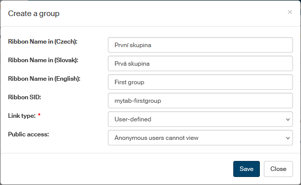
The Link type field is not used for groups and no setting is needed here.
Use the Public access field to set the group’s public visibility. The options include “Only anonymous users can view”; in such a case the group will not be displayed to any logged-in users.
Click Save to confirm the details and create the group.
Editing a group
A group always contains a group of edit buttons you can use to set up its properties. Most of the buttons have the same functions as the tab setting buttons. The buttons offer the following functions:
-
Add section – adds a new section to the group.
-
/ Show or hide. If the group is set to show, it will be displayed in the ribbon to the users who are authorized to see it. A hidden group is not displayed to anybody and is marked with the symbol in administration.
-
Set permissions – displays a dialog window where you can assign or remove the privileges to see or edit the group.
-
Edit group – displays a dialog window where you can edit the group’s basic properties (just like when creating a new one).
-
Show effective permissions – displays a dialog window with a list of users authorized to view or edit the group.
-
Delete group – removes the whole group. Cannot be applied to system items.
Adding and editing a section
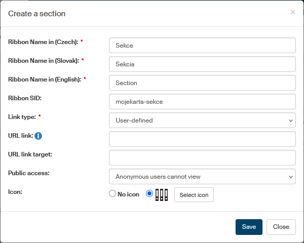
Creating a section
Click next to the selected tab group to add a new section.
A dialog window is then displayed, where you can enter the basic details of the section, such as the name (you can choose different names for different language versions) and a unique Ribbon SID.
If you want to run a specific function or open a page by directly clicking the section, select the Link type and fill in the following field. For more details, see chapter Setting up section contents.
Use the Public access field to set the section’s public visibility. The options include “Only anonymous users can view”; in such a case the section will not be displayed to any logged-in users.
In section Icon, you can choose an icon to use as the section symbol. Click Select icon to display a dialog with icon selection and select one. An icon is not mandatory, you can keep the No icon option.
Click Save to confirm the details and create the section.
Setting up section contents
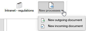
There are two ways to use sections:
-
The section is a button, meaning that clicking the section will directly run the function (display a page) set up in section properties. In this case, select the Link type in section properties and based on the type, fill in the following field:
-
User-defined – when a user clicks the section button, FormFlow displays a page or runs a function whose URL address is set in the URL link field.
-
Process folder – when a user clicks the section button, FormFlow displays a selected folder on the Process tab. Select the folder to display in the Process folder field.
-
Document folder – when a user clicks the section button, FormFlow displays a selected folder on the Documents tab. Select the folder to display in the Document folder field.
-
Link to form – when a user clicks the section button, FormFlow displays a new form to fill in. In the Form template field, select a template stored in FormFlow to be used for creating the new form.
Use the next field URL link target to specify whether the open the page in a new browser tab (
_blank) or the same one (_self). Other available options are_topand_parent. -
-
The section is a drop-down list, meaning that clicking the section will display a list of buttons placed in the section; only these buttons then run the specific functions. In this case, do not specify the Link type and the following field, and continue creating the structure by adding buttons. Use the
button in section settings.
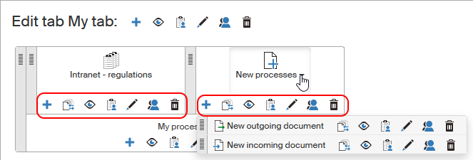
Editing a section
A created section contains a group of edit buttons you can use to set up its properties. Most of the buttons have the same functions as the tab or group setting buttons. The buttons offer the following functions:
-
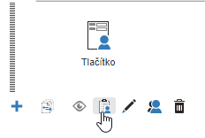
Create button – adds another item to the section.
-
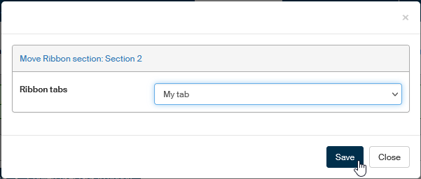
 Move section – moves the section to another tab. Click the button and a dialog will be displayed with a list of existing tabs. Select one and click Save to confirm the move. Then you can drag the section using a mouse to a specific place on the tab.
System sections (on tabs DASHBOARD, DOCUMENTS, PROCESSES and ADMINISTRATION, My settings and Help) cannot be moved. -
/ Show or hide. If the section is set to show, it will be displayed in the ribbon to the users who are authorized to see it. A hidden section is not displayed to anybody and is marked with the symbol in administration.
-
Set permissions – displays a dialog window where you can assign or remove the privileges to see or edit the section.
-
Edit section – displays a dialog window where you can edit the section’s basic properties (just like when creating a new one).
-
Show effective permissions – displays a dialog window with a list of users authorized to view or edit the section.
-
Delete section – removes the section.
Adding and editing a button
Creating a button
To set up a section so that it contains a menu with several items, add them using the button in section settings. A dialog window is then displayed, where you can enter the basic details of the button, such as the name (you can choose different names for different language versions) and a unique Ribbon SID.
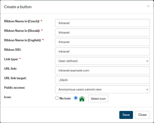
Select the Link type and based on the type, fill in the following field:
-
User-defined – when a user clicks the section button, FormFlow displays a page or runs a function whose URL address is set in the URL link field.
-
Process folder – when a user clicks the section button, FormFlow displays a selected folder on the Process tab. Select the folder to display in the Process folder field.
-
Document folder – when a user clicks the section button, FormFlow displays a selected folder on the Documents tab. Select the folder to display in the Document folder field.
-
Link to form – when a user clicks the section button, FormFlow displays a new form to fill in. In the Form template field, select a template stored in FormFlow to be used for creating the new form.
In the next field URL link target, specify whether to open the page in a new browser tab (_blank) or the same one (_self).
Other available options are _top and _parent.
Use the Public access field to set the button’s public visibility. The options include “Only anonymous users can view”; in such a case the button will not be displayed to any logged-in users.
In section Icon, you can choose an icon to use as the button symbol. Click Select icon to display a dialog with icon selection and select one. An icon is not mandatory, you can keep the "no icon" option.
Click Save to confirm the details and create the button.
The created item is only displayed after clicking the corresponding button in both the administration and the resulting ribbon.
Editing a button
In addition to the name and icon, a group of edit buttons is displayed next to the item, and you can use them to set up its properties. Most of the buttons have the same functions as the tab, group or section setting buttons. The buttons offer the following functions:
-
Move button – moves the button to another tab. Click the button and a dialog will be displayed with a list of existing tabs. Select one and click Save to confirm the move. Then you can drag the button using a mouse to a specific place on the tab.
System buttons (on the DASHBOARD, DOCUMENTS, PROCESSES, ADMINISTRATION, My settings and Help tabs) cannot be moved. -
/ Show or hide. If the button is set to show, it will be displayed in the ribbon to the users who are authorized to see it. A hidden button is not displayed to anybody and is marked with the symbol in administration.
-
Set permissions – displays a dialog window where you can assign or remove the privileges to see or edit the button.
-
Edit button – displays a dialog window where you can edit the button’s basic properties (just like when creating a new one).
-
Show effective permissions – displays a dialog window with a list of users authorized to view or edit the button.
-
Delete button – removes the button.
Item reordering
Items already created on the tabs (groups, sections and buttons) can be later moved within the same tab or to another existing tab.
Moving items within a tab
Use mouse dragging to move items to another place on the same tab. Place the mouse cursor on the vertical strip on the left side of the item and click and hold the mouse button down to grab the item.
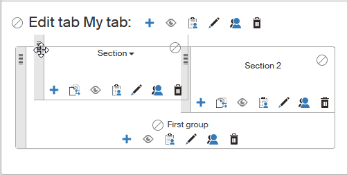
Then move the item to the required place on the tab. Release the mouse button Confirm the move by clicking the Save the order button above the list of tabs; only then will the changes in order apply.
Permission settings
The procedure for setting the permissions for users, groups or roles is the same, whether you are setting permissions to an individual button, section, group or a whole tab. In all these cases, start by clicking next to the corresponding item.
A dialog window is displayed, divided into two tabs: you can use the upper part of the page to switch between a list of users and a list of groups and roles. A filter is also placed above the list, and you can use it to look up individual entries.
Check or uncheck the individual permissions for every entry (user, group or role):
-
Permission to read;
-
Permission to edit;
-
Permission to delete;
-
Permission to grant permissions.
You can click to check all the fields and assign the user, group or role all the permissions at once, or  to remove all permissions at once.
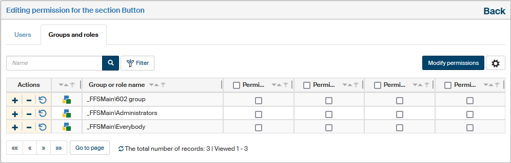
If the User tab shows a blue star next to a permission checkbox, it means the user has already gained this permission by being a member of a group that has been granted this permission. Hover the cursor over the star icon to see a tooltip listing the groups and roles with this permission.
Click the  Regenerate ribbon cache button to update the ribbon permission cache for the given user.
Confirm any changes by clicking Modify permissions (if editing a button) or Permission change in the whole tree (for all the other items – the title reminds that the permission change will also apply to child items). Use the Back link in the top right corner to return to the tab structure.
If you want to check the overall permissions assigned to a user (i.e. permissions assigned both by being a group/role member and individually assigned permissions), return to the tab structure and click Show effective permissions next to the item.